Modernising a Trusted Brand Without Losing Identity
The Challenge
Waterlink is a long-established Australian business with decades of experience in commercial swimming pool systems. While the brand was trusted and widely recognised, the absence of clear brand guidelines had led to fragmented execution across suppliers, equipment, and marketing materials.
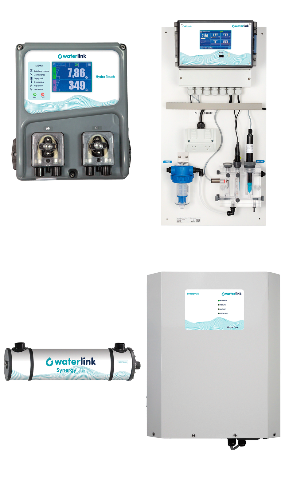
This was most evident in the front-panel labels—the primary brand touchpoint customers interact with daily while managing water systems. Multiple generic designs diluted consistency and weakened the brand’s modern, technical perception. The same issue extended across graphic materials, industry event displays, and digital channels.
The challenge was to restore clarity and modernise the brand system without losing the recognition and trust built over the years in a highly specialised market.


What We Did
We refined the existing logo and redesigned the drop symbol to express better the idea of “link” — reinforcing how Waterlink products connect and manage water systems.
We also developed a clear brand guideline to give Waterlink a consistent, repeatable system that suppliers, partners, and internal teams could apply with confidence.
The updated identity was rolled out across:
-
Front panel labels and equipment interfaces
-
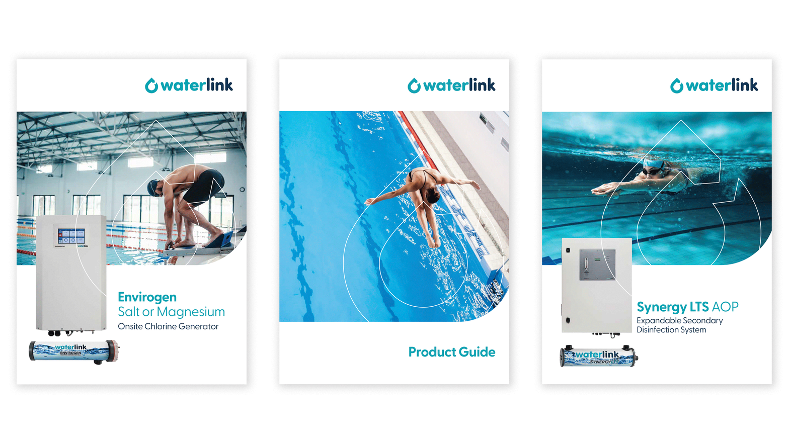
Graphic and digital marketing materials
-
Visual communication for industry events
-
Retail and partner-facing assets
The redesign delivered a clearer, more consistent brand system, while maintaining the colours, typography, and familiarity trusted by existing clients.

The Impact
The refreshed brand system gave Waterlink a clearer, more consistent presence across all touchpoints. Most importantly, the redesigned front panel labels now serve as a constant brand reference for operators — ensuring Waterlink stays top of mind at the exact moment service and buying decisions are made.
By replacing fragmented visuals with a consistent identity, the brand strengthened its technical credibility while protecting long-standing recognition. The new guidelines also made it easier for suppliers and teams to apply the brand correctly, supporting consistency, confidence, and long-term growth.
Why This Matters
This project shows that updating a brand doesn’t have to be disruptive. Done properly, it can strengthen recognition, improve clarity, and support future growth, without losing the identity clients already trust.